Showing posts with label pigments. Show all posts

Sunday, January 25, 2015

When life gives you yard waste

Add fire.  Always.


BUT... if you are careful, you can extract something useful, too.

Fire, as we view it, is a chemical reaction.  We are watching the products of a combustion reaction beautifully expand to illuminate and warm whatever we chuck next to them, be it marshmallows or a piston engine.  Oxygen is essential to get this reaction to go and so, if you limit the amount of air that gets to your yard waste (carbon rich fuel), you get an incomplete reaction.  There is still plenty left to burn on another fire... so, you have charcoal.

Now, you are playing roulette with your health if you use yard waste to make charcoal for cooking; there are some potentially lethal chemicals in the plants about your yard.  Additionally, these 'charcoal' bits are hardly the ingots we need to feed a fire with any degree of cleanliness or practicality.  Being useless for everyday survival, it seems like we are talking about art now.  Funny how that worked itself out...

Enter, wisteria trimmings:


Most of these vines are small, so they will make charcoal sticks that are far too fragile to draw with.  These small ones will be pulverized and used as pigment (more on that later).  Only big sticks will be kept for drawing charcoal.  It should be noted that wisteria is traditional as a drawing charcoal source.  The other common one is grape vines.  But I tend towards decorative and not useful plants, so there you go.  Did I mention that it is almost February and I am only now getting around to autumn pruning?


1. wisteria (or grape) vines
2. pruners/cutty thing
3. metal can with top lid removed
4. aluminium foil
5. fire source of your choice (more below) 


Cut your vines down to lengths that can fit into your can, then pack them in.


Use the foil to tightly cover the can on the top and sides.  Remember, you are trying to have a smothered fire going, an incomplete combustion reaction because of limited oxygen.  Some oxygen still needs to be there, so do not enclose the can.  Water vapor and other gas needs to escape, too.


Not the most glamorous angle, but, life is tough when you are a can.


I am using charcoal briquettes, lit to keep a flame, in a Weber kettle for my fire source.  Plus, I needed to cook something.  It should be noted that you really are not looking to add meaty-goodness into your drawing materials, so keep anything that will drip juices well away.


So, the can is going to sit in the fire (I am keeping the vents open on the top of the kettle) for about ten hours.  Basically, I let it sit over night, let the fire burn out, and then went to get it the next morning.

I'd say it's past medium-rare:


Peel back the foil and see the finished charcoal.


Yay!  Incomplete combustion!!  If more oxygen had weaseled in there, you would be left with white ash and not that iridescent black.

There still is ash and bits of sloughed-off bark in the bottom of the can.  Dump out the finished charcoal and pick out the useful bits.


Not bad for yard waste, no?


Now, all of the small vines will break when you draw with them.  So, put those aside for another project.  You have made pigment, suitable for paint emulsions and other mediums.  It is closest to Lamp Black in coloring and origin, but I feel like it deserves a more festive name which gives due reverence to the grilled chicken.  Any ideas?

Friday, August 17, 2012

Making Paste Paper

This is one of my favorite projects.  The end product is much more than the summation of the humble materials.


Materials can vary, but you need paste and paper.  I am using a medium weight cold press Arches because I am going to use the paper for soft-cover notebooks.  Technically, you could use whatever paper you want.  If you plan on using this paper for art purposes, then use something archival.  If you are making gift wrap, then maybe some butcher paper or craft paper is the more economic option.  The one thing to keep in mind is that a light weight paper will curl and wrinkle like crazy when you put the paste on it and more so as it dries.  So plan accordingly.  For paste, you could use a regular, cooking flour and water slurry, but I like my nice wheat flour because it makes for a less goopy and more translucent paste.  But again, if you are just making up gift wrap, do yourself a favor and go cheap on this.

The funny thing is that I always forget how far the paste goes.  I always think that I have just enough for a few sheets and it turns out that I have enough to mural the house.  So a morning project always morphs into a whole day of painting and messy hands.

The last component to the process is pigment, or some form of color.  You can use anything water-based to tint your paste.  Today I opted to use some leftover tubes of watercolor and gouache (from years ago, before I started making my own paints).


I am doing all of this on a tarp.  Well, it is my shower curtain.  It is due for a wash and the naturally water resistant nature of the fabric makes this very easy to clean.  You really will need to put down some type of tarp.  No matter how clean you are, you will always have a bit of paste on the edges of the paper and then this will transfer to other things.  Try to use a dark fabric, just because pigments like cadmium (bright red) never seem to wash out of things.  So yeah, my shower curtain now looks a bit like a Psycho throwback.  Can't wait to explain that one to house guests.

I also have extra containers for mixing, brushes for mixing, water for thinning the paste down, a paint knife for well, whatever, and then anything that might make an attractive mark in the paste.  Stuff like stamps, combs, etc.


The procedure is pretty foolproof.  The only hard part is that you don't want chunks of paste in your mixture.  If you have ever made any instant food product from a powder, you know the way to avoid this is to slowly mix in fluids or to pass everything through a sieve/strainer.  Make your choice on this.  Personally, I just try to slowly add in fluids. 


So I add in pigment and then mix until I get paste that is the consistency of runny yogurt.


Then, just start painting.


You can do multiple coats so you have different colors.


Once the paste starts drying, you can start stamping.


If you stamp while things are still really wet, the stamps tend to be loose and undefined.


Of course, this can be a nice look sometimes.


You can also combine stamps with drawing.  Just use something a bit blunt as a stylus, otherwise you risk tearing up your damp paper.


Same thing goes when you use a comb to make marks.  It is so easy to rip up the paper if you aren't careful.


Or you can just play around with your brush strokes.


Once you are done 'painting', let the paper dry.  It should be ready for art or crafting within a few hours.  There might be some curling or wrinkling of your paper once it dries, but this should relax as the environmental humidity rises or after you lightly dampen (via the back) and press/stretch the paper.  Or if you just put glue on the back as you use it for a project, that will flatten things right out.  The heavier the paper you use, the less of a problem this will be.

I hope that you have some fun with this.  As long as you keep your paint/pigment non-toxic, this can also be a kid-friendly project.  Just use a reeeeaaallly big tarp then.

Saturday, August 11, 2012

The Odd Couple: Watercolor and Gouache

In true Odd Couple form, watercolor and gouache can live together, work together, but they behave very differently.


When I posted on making paint, I made up a bit of both watercolor (L) and gouache (R).  They are both the same recipe (water, gum arabic, glycerine, honey,and  a bit of thymol), except gouache has a bit of Calcium carbonate.  This addition is what makes gouache opaque , so you can cover and correct things.


This is watercolor medium and pigment:


This is gouache medium and pigment:


At first blush, why wouldn't you want to always have opacity?  Why would you ever use watercolor if you could use gouache?  There must be some horrible, horrible catch...

AND THERE IS...sort of.


The catch for this chalky addition to your paint is the dulling it causes.  All gouache will dry duller (more chalky) than the brilliant, wet paint.  This means that light colors will darken and dark colors will lighten... in a dirty looking sort of way.  You can imagine the nightmare of trying to remix/color match a wet paint to a dried color.  In the picture above, this is the mostly scraped glass that I made my paints on.  The watercolor was made on the left and the gouache is on the right.  You can already see that the watercolor is darker and richer.

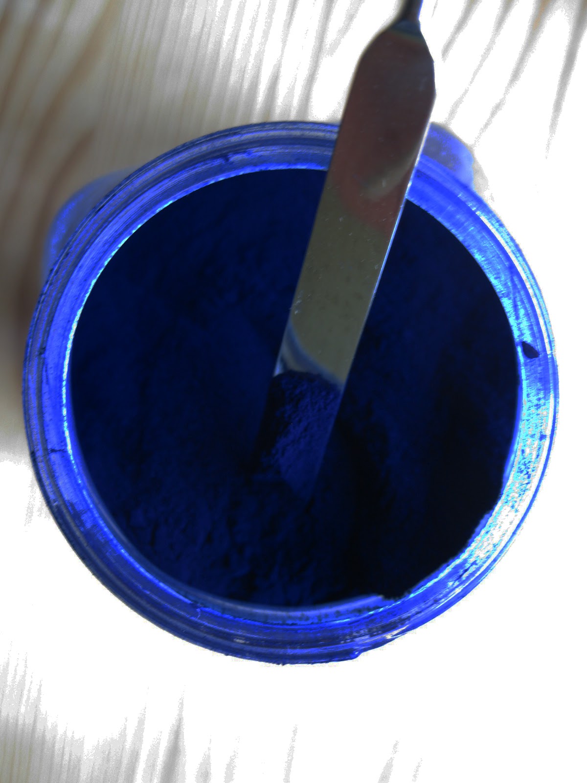
But this paint is Prussian Blue.  It is a bit transparent, as paints go, but not really.  If you look at a paint like Alizarin Crimson, which is really transparent as a watercolor, it is very different as a gouache.


Starting from the top, Alizarin Crimson watercolor, then its gouache, then Prussian Blue watercolor, and then its gouache.

Close up!


But don't hate on gouache just yet.  It has so much more body than watercolor and gives you a much more substantial painting.  I will often put down a base painting in gouache and then 'glaze' with watercolor on top of it.  Also, if you spray your gouache with a varnish (see footnotes), the colors will go back to their wet appearance.

On an interesting side note, Calcium carbonate is an extender/filler that is put in cheap paints by some manufacturers.  This is generally why expensive paint is more brilliant and the transparent pigments more 'clear' than their cheap counterparts.

So check out the ingredients on your paints before you buy them.


There are many different types of varnishes, but I recommend these from Golden:
http://www.dickblick.com/products/golden-archival-spray-varnish/?clickTracking=true
There is a matte, satin, and a gloss.  I have all of them but I generally use the gloss because I am really shallow and like shiny things.

Friday, August 10, 2012

Making Paint


Let's keep this simple.  Paint is just two things, pigment and medium.  You buy pigment (unless hard rock mining is your scene) and then you mix it into your medium.  Well, pulverize it for the best results.


1. Pigment
2. Medium
3. Muller
4. Glass plate
5. Micro spatula
6. Paint brush (optional)
7. Razor/bench scraper/ceramic spatula (optional but HIGHLY recommended)
8. Containers for finished paint (unless you are using it all immediately)


This is a muller.  It is made of blown glass and it has a 'rough' bottom to grind your pigments into your medium.  The more you grind, the more buttery the texture and in some circumstances, the more brilliant the color.  You want to grind on a glass plate because it is a smooth, non-porous, non-reactive surface.


Before you get started, remember, almost every pigment is a heavy metal and it will eventually kill you.  Do not inhale and do not ingest.  So do this in a well ventilated area (wearing a mask is ideal), do not do this on a surface where you will EVER be eating off of, and wear gloves or be super paranoid not to touch the raw pigment.  Seriously.


Alright, now that I have killed off all excitement, let's get started!


There is a recipe for each medium and a ratio for how much medium goes with how much paint.  Since this is a recipe, it calls for a cookbook.  Even if you come up with your own mixture, you should start with a proven method, just to help you troubleshoot any technical issues.  The best book that I have ever come across is The Painters Handbook (see footnotes).  Before I start grinding with the muller, I do a quick mixing (just to eliminate loose pigment) with the micro spatula.


I tend to use/make water based paints because they dry faster, thus allowing me to get in more detail in less time and manipulate older paint layers (unless it is egg tempera, but that is another post).  My basic medium that I make up is for watercolor.  For this, I use a mixture of gum arabic, honey, glycerine, water, and a small amount of thymol, which is an anti-fungal.  Just remember that you are making something which can rot, so some sort of preservative will keep your paint from molding or fermenting.  You can use other things, like clove oil, but I use thymol because I already had it to add to my wheat paste when I cook it.  When I want to make gouache, I just add in some Calcium carbonate to my watercolor medium.


While there is going to be a prescribed ratio of pigment to paint, you can play around with this, too.  You want to make something smooth and buttery with the consistency of clotted cream.... or instant pudding.  No judgements...


Now put your paint into a container.  Got it?  You have paint!  I would also point out that if you start pricing out the cost per volume on your paint, it is about 4x cheaper than the bought stuff.  Unless, you are buying junk, but then, really, why bother.

I hope this is a good starting point for you!


When making paint, try to do it 'right' the first time and then come up with your own house blend on the next batch.  I like The Painter's Handbook by Mark Gottsegen because it also explains the 'why' of what you are doing and what exactly each ingredient is doing:


Thursday, August 2, 2012

We were talking about Pigments, right?


I tend to get into anything that allows me to obsessively buy and collect things.  This is my favorite reason for making paints.  Sure, there are better reasons (quality control, cost, feeling of superiority), but just looking at a shelf full of color is like opening up a new box a crayons, every time you look at it.  I will do some paint making demos later, but for now, I think some background information on pigments would be helpful.  To begin with, everyone used to make their own paints.  Some pigments came from local minerals/organic materials and others were sourced in.  Depending on where you lived, there were variations in these 'earth' pigments.  This, combined with the natural light of your geographic location, really flavored the palette of an artist.  Eventually, these traditions built up into painting methods (bistre vs. grisaille...for the under paintings).  As time went on, these methods managed to influence the demand for certain pigments and ultimately, the development of synthetics.  Synthetic pigments can mean several different things.  Sometimes they are chemically identical, just lab made, and other times they are chemically different, with different properties (luminosity, lightfastness, opacity).  Generally, the reason for the later was because the original pigment was ridiculously toxic.  Of course, most pigments are heavy metals and should be treated as a small python; sure it is little and cute now... but keep around it for 20 years and it will eventually injure or kill you.  Those heavy metals build up in your liver and other filtering organs and eventually bad things will happen.  And that's not even talking about the carcinogenic pigments.  So please, handle with extreme care.

One of the more toxic pigments, Vermilion, is a great example of the evolution of pigments and the breadth of choices for the modern artist.  Originally, Vermilion was ground Cinnabar, HgS.  It is a Mercury compound and so it is crazy toxic.  So now, you can only really get 'Vermilion' or 'Vermilion Hue' and generally it is made with Cadmium (not too much of an improvement).  The funny thing about Vermilion, is that everyone made it a little differently in the past and these color choices are still influencing the modern formulations.  The more you grind down Cinnabar, the bright and orange it becomes (it also becomes more susceptible to fading).  It starts out kind of Rose Madder-y, and then it goes, well, Vermilion---French Vermilion anyway.


Most of our modern ideas on the 'correct' hue of a color stem from the French aesthetic of the color.  I am not really sure why, but I just think that bright colors are just better at attracting attention than their duller versions.  In general, French painting embraces very bright, vibrant, jewel tones (just check out any Impressionist piece), though it may be on top of a grisaille under-painting in older paintings (like a Fragonard).  Bearing this in mind, if you are buying pigments and paints from a French company (Sennelier being the main one), you are going to get much, much brighter versions of the same 'pigment' than you get from other makers.  Just look at this:


Two different examples of the 'same' pigments.  These are Sennelier's (L) and Sinopia's (R) versions of Green Chrome Oxide and Venetian Red Earth.  Crazy, right?


So I buy different colors from different companies.  I use Italian sources for my earthy colors (in bistre tradition), French for my jewel tones, and English/Japanese/American for things in between.

Be the obnoxious source of information on Vermilion:
http://en.wikipedia.org/wiki/Vermilion
Be even more obnoxious with grisaille:
http://en.wikipedia.org/wiki/Grisaille
Now make them loath you with bistre:
http://en.wikipedia.org/wiki/Bistre
Okay, woo them back with Fragonard:
http://en.wikipedia.org/wiki/Jean-Honor%C3%A9_Fragonard
And everything is forgiven with Impresionists:
http://en.wikipedia.org/wiki/Impressionism

Wednesday, August 1, 2012

No Right Answer: Conservation or Restoration

This is always a loaded topic and most people have very firm opinions.  I should explain that my own opinions are molded by a family that has managed museums and special collections, my own training in restoration and conservation, and then my earlier academic focus in the sciences.  In short, I think everything is in a state of decay and, thermodynamically speaking/entropy-wise, this is true.  Most of my restoration work has been with paper based materials.  Here, death is much, much more rapid.  To further complicate the matter, most paper based media are mass produced in some way.  So is it worth it to restore to it's original form?  Should we delay the inevitable end with conservation or should we do a 'functional restore', where the focus is on usability and not the original form.  For the later, digitization is often the best option.  Scan it in and get it done.  However, if the piece has enormous sentimental value or artistic/monetary merit, more work is in order.  Generally, conservation/stabilization is the quicker and cheaper, thus being the most popular fix.  Every once in a while, there is something which makes it to the restoration pile. 

1. One 'ol Bible

2. Klucel-G and isopropyl alcohol

3. pigments and acrylic medium


Right now, my 'pile' is an old Bible.  When I worked in a book restoration/paper conservation studio we had tons of these exact Bibles come in.  Normally, work didn't make it past the initial consult; there was too much money to do the work compared to the meager monetary value to the piece. These Bibles are all late Victorian and almost every household in the US bought one of these through the Sears and Roebuck catalogue.  In fact, this one is not a family piece, but was picked up for $1 at Goodwill.  So spending the thousands on a very thorough restore is not going to happen.  But the family like it and would like to use it.  A 'functional restore' is in order.

First step is the cover.  Red rot has taken over the leather so it needed to be consolidated with a solution of Klucel-G.  I should mention that it takes an eternity for the Klucel-G to dissolve into the alcohol in the Pacific Northwest.  I would imagine that anyplace cold and damp would give similar issues.  To recolor and resurface the leather, there are a few options.  You can build up oil based dies and conditioners or you can use water based pigments and then 'refinish' with an acrylic.  I went with the acrylic.  It is going to be faster, less expensive, and ultimately hold up better since there are going to be other issues with patching and joining the leather (more to follow on that).  The picture above is after consolidation but before the coloring and patching.

This Bible also has some stamp gilding on it.  Restoring that just isn't going to happen.  To do it right, you need the stamping foil, a stylus, hot plate (the ones designed for leather work), and then a steady hand to free-hand the designs.  I currently don't have the $1000+ to get the plate, so that is going to go on the Christmas wish list. *hint*hint*hint*  Or I would settle for a kitten.  I am pretty easy to please.

I use Talas for all my restoration products:
And you could use any retailer for you pigments, but starting with the raw pigments will give you greater color-matching ability and it will ultimately prove much, much less expensive.  I use Blick to buy my pigments.  For this project I was using a combination of Sinopia and Sennelier.
For an acrylic binder, just use a generic binder.  Just make sure that you are using a 'medium' and not an 'addative'.  If you do opt for the oil/conditioner route, just get that from Talas.